How Successful was your front cover?
For my first attempt of using Indesign I think it is successful in targeting the audience of sixth formers by advertising new cooking classes in a fun way shown by the flour on the face. I managed to download fonts and produce a consistent house style. The contents page was also successful because it followed the same house style as the front cover. It delivered the message I wanted but could be more successful in looking more professional and less home made.
Which aspects of your cover do you think need a rethink?
The placing of the main image is wrong because I wouldn't put text on the bottom right hand corner which makes it look empty. If I re-did this I would make sure the image was positioned on the right hand side to follow magazine conventions. The writing above the circle on the front cover could be curved to make the cover look more interesting. The contents page boxes could of been lined up more precisely.
How similar was your final cover to your flat plan? Was there any changes if so why? and how could you improve the effectiveness of the planning stage?
My front cover is different from my flat plan because the first design was with 3 circle images on the right hand side however there wasn't enough room t position them there. I changed the Mast head because it didn't appear big enough on the front to attract people which meant I had to move around other sub-titles on the page. I also didn't need a bar code because the magazine is free. I have leant not to overload the design because the objects appear bigger than expected. I would also need to ask peoples opinion because what I like other people might not.
What are the strengths of your contents plan/finished product?
The font and the pink glow of the Mast head I like because its attractive and appealing to the target audience. I managed to give photos glow on the contents page with made them enhance the page and look more professional. I think it looks trendy and appealing to sixth formers because I would like to read it so successfully meets it target audience.
Overall what practical skills have you developed during your work on the preliminary task?
I learnt to add effects to objects which was useful as it emphasizes importance. I learnt how to use the magic tool in photoshop to cut out images in order to place them on a background. I learnt how to colour text and give it an outline. I also leant how to make images transparent and give gradients to colour.
What key lessons been that you need to carry forward into your main task?
Take enough photos so I have enough to choose from. Place the main image carefully so that I have enough room for writing. Don't use too many fonts because its distracting and makes it look less professional. Make sure the page numbers can be shown to stand out from the page contents.
Thursday, 21 October 2010

Tuesday, 19 October 2010
Contents Page
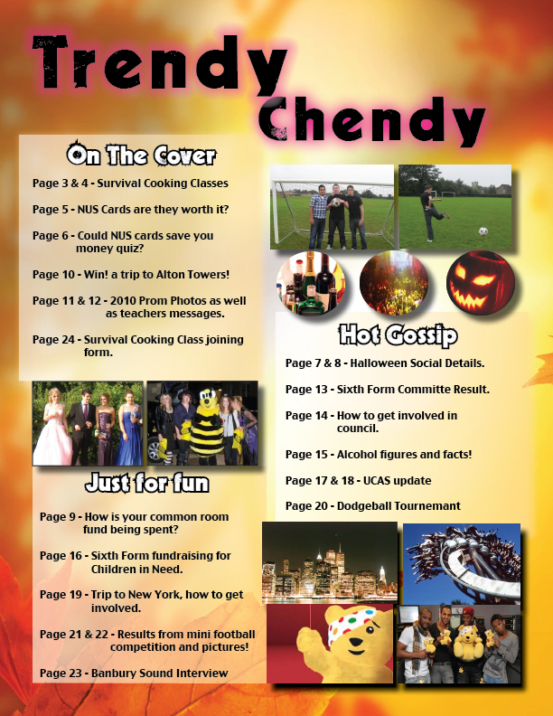

This is my finished preliminary task of a school magazine.
Thursday, 14 October 2010
Finished Front Cover of School Magazine

This is the my finished first attempt of the school magazine for Chenderit. I had never used Indesign before and only knew the basics on photoshop. I decided to target my magazine to Sixth Formers as I thought it would be interesting to do a more young adult style magazine for 16-18 year olds rather than a wider age group as I was able to target key ideas more easily. An example of this is the Survival cooking classes for university, as students leave home without basic cooking knowledge so that was the key idea for my magazine to promote. I had Elli in the middle of the magazine, with an apron, flour on her face and her smiling this was important as the classes need to be shown as fun and interesting rather than academic because the sixth formers wouldn't be interested otherwise. I named the magazine Trendy Chendy this is a casual name and would attract the students rather than the parents which I wanted. I managed to make the title glow with pink to make it stand out. i also decided to use pink as it appears in the main picture on the bowl and apron. I learnt to change colour's of text and give them a gradient. Another technique I liked was the outline of text with helped to emphasis the important of key phrases. The magazine differed from my flat plan because I only included two pictures, I thought that with too many pictures it would make the magazine too complex and would put students off reading it. I used a leaf style background to show that the magazine was the autumn addition. I cut Elli out on photoshop and inserted her onto the background, this was a good technique to learn as I may use it for my final music magazine. I am happy with my first attempt but I did struggle with trying to curve text around the prom photo, which would have been good to know. I now know that I should situate the picture more to the right as I couldn't fill a gap as it didn't look right.
Tuesday, 5 October 2010
Flat plan for school magazine

This is the flat plan for my school magazine, aimed at sixth formers, i've designed it with the key aspect being the cooking classes for sixth formers to survive in university, and 3 images down the right hand side of other aspects of sixth form life such as a mini football competition, and common room. On the left I will have writing advertising the new classes, and what to expect in the magazine but also include a competition to attract the sixth formers.
Ideas for the school magazine
This was a quick brainstorm of names for my magazine, the possible target audiences, props that I may use, and what were the key main ideas that the magazine is trying to promote.

Thursday, 30 September 2010
Initial Research of existing school magazines

This magazine cover gives the initial impression that the school is creative, arty, and technical. This is shown by the pencil image, and the piece of art in the centre of the page. The green, blue and red computer image represents the school using technology, which would attract parents, as it shows the school as good resources. The pale yellow background is a neutral colour of gender so would attract both boys and girls. The image is similar to the shape of the world making it interesting for the reader to see images coming of in different directions. The front cover contains little writing this works well as the images explain a lot without too much writing which would bore the reader. The font of the magazine is quite modern, not fancy or hard to read, this could suggest the school is suitable for everybody not just wealthy children. The audience of this would be for sixth form, as it comes across as hardworking, independent and the students developing as individuals.

This magazine over gives the impression that the school is fancy this is represented through the black artwork coming from the side of the page. The magazine is a foreign school magazine, with the logo in the middle, which gives the logo importance, as it’s the centre piece. There is again little writing on this magazine, which attracts the reader, as the main text would be inside of the magazine not on the front. The colours are interesting as they merge into one another, this could represent the school being good at i.c.t or creativity. The audience of this would be for the adults primarily because it makes the school look quite posh with no images of the students.

This magazine cover is a medium shot which is the shot I will be using in my preliminary task. On this magazine it establishes that the school is sporty and is passionate about outdoor sports. There is a range of colours used on the magazine, in my opinion this makes the magazine too distracting, and some of the words are hard to read with the background. The “Homeschooling” attracts the reader because its in bold, a solid colour and bigger in size than the other writing. The initial impression of this magazine would be that its simple, appeals to children who love the outdoors, the magazine doesn’t look partially professional which could suggest that the school is based more on experiencing other activities than the classroom.

This magazine cover puts the school across that it cares about studying, this is shown through sharpening a pencil, showing that its reads sharpening because it has been worn down by work. The magazine is simple and not too busy but gives the impression that it’s a precise sophisticated school. The target audience would be for the parents, as it gives the idea of professionalism. The colours are quite plain and focused which could correlate the idea that the school if focused on education.

This magazine cover attracts both students and parents as the child is smiling whilst working showing school as a positive thing. The leaves suggest this is the autumn addition of the school magazine. The writing is quite hard to read with the background, and the neon green front draws attention away from the masthead. The magazine doesn’t have too much writing which attracts the reader as it only gives a teaser of what to expect when reading the magazine.

This magazine cover gives the impression of a private school, shown through the pictures of royalty and the rich green background. The images are of individuals suggesting to the reader that the children will develop as individuals; the magazine is aimed at the parents as its promoting the school through the pictures of adults rather than lots of the children. The gold outline gives the impression of rich, posh and well educated schooling. The logo being in the middle of the page emphasizes the importance of the school.
Tuesday, 28 September 2010
Subscribe to:
Posts (Atom)