
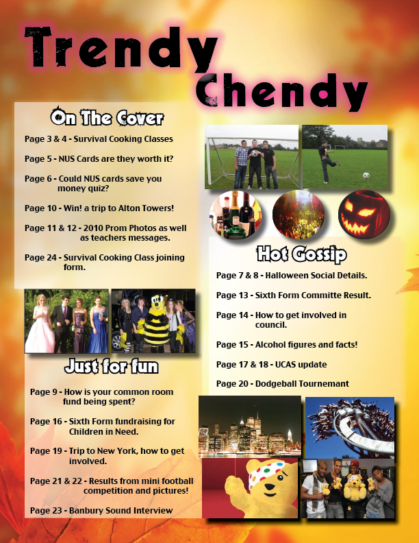
This is my contents page which i created. I made sure that I used the same theme as my front cover, to give consistency throughout the magazine. I made sure to include lots of images because too much writing would put sixth formers off, I learnt to shadow the images, and shadow the text boxes so they look part of the magazine rather than it looking basic. I decided to make he 3 main titles: 'On the Cover, Hot Gossips and Just for Fun' in white writing with a black background to make it bold and to attract the reader. I used the front 'Decade' downloaded from www.dafront.com this front looks similar to urban youth writing, so would appeal to my audience. I also made the pictures look exciting by including JLS a big boy band to encourage the reader to read the page about fundraising. I thought that the square images worked well except too many of them made the contents page quite bland so decided to use circles, I though this made my contents page look too busy with too many gaps, so in my final music magazine I will insure I cover up as much a possible. Too improve I will also highlight the page numbers from what it contains as the difference isn't highlighted in my magazine.


This is my finished preliminary task of a school magazine.

No comments:
Post a Comment