
Saturday, 23 October 2010
Music Magazine Research
By typing into google I found 15 British music magazines however there are many more than this.
TV/MUSIC GENRE


- The X factor magazine this would be aimed at teenagers this is shown by the artists would aim their music at this audience. Teenagers are also the age group that watch the X factor so is another reason why it is aimed at them. The purple and orange colours suggest that it’s aimed towards girls more than boys because it talks about the celebrities’ hair and fashion. It’s quite a busy looking magazine and this wouldn’t appeal to adults. The publishing house of The X factor magazine is: Haymarket Network.
- The link to this magazine is: xfactor.itv.com/2010/xmagazine/
- Top of the Pops magazine aimed at 10+ it is aimed at girls because the main articles are to do with “hot” boys in music. It is again a busy looking magazine so wouldn’t appeal to an older audience. This magazine is designed for children 10+ shown by the simple language, and advertising games and quizzes in the magazine. The Publishing house of the Top of the Pops is: Frontline distributors with Emap and Haymarket; BBC Haymarket Exhibitions; and Galleon, for subscriptions.
- The link to this magazine is: www.totpmag.com
- These magazines are produced weekly for a cheaper price of £1-2, this is because it is designed for teenagers/children and they won't read a thick magazine as well as the fact that the parents don't want to pay too much.
- The magazines would be distributed in mainstream retail this is because the magazines would be brought by parents when children would be shopping at the supermarket with them. The X factor magazine is also sponsored by tesco's so this is exclusive to this retail supermarket.

- Q, magazine this is aimed at older teenagers and young adults this is shown by the more sophisticated look compared to the children’s magazines. The image above of Q magazine is Lady Gaga half naked; this would appeal to boys of the older teenager/young adult but not to adult men or male children. Q magazine is published by: Bauer Media Group Bauer Verlagsgruppe
- The link to this magazine is: www.qthemusic.com
- NME magazine appears to be focused on the latest music and key TV and media stars, so it doesn’t have a specific theme but focus on what’s relevant at that moment. It created the first
UK - The link to this magazine is: www.nme.com/magazine
- Rolling Stones magazine doesn’t have a specific theme, it focuses or stories of celebrities and TV, it has in depth stories and can focus of political situations at the time. The audience of this magazine would be adults and middle aged because of the depth of the stories and the focus of politics this wouldn’t appeal to a younger age group. The publishing house of this magazine is ACP.
- The link to this magazine is: www.rollingstones.com
- The magazines are produced monthly at an average price of £4 this is because it is a thick magazine, glossy, and can fill the magazine more information than weekly updates as well as the fact that the target audience of adults wouldn't buy a magazine weekly, but occasionally.
- These magazines would be sold in mainstream retail, but subscriptions of these magazines are also available.

- Mojo magazine is a sister magazine to Q magazine. It’s shown to be a rock magazine by the colours of white, black and red which are quite bold and are commonly associated with rock. The target audience of this magazine would be adults and middle aged but also may appeal to some people of a younger age, the reason its aimed at these people is because it includes music heroes from the era in which they could be growing up, and includes articles such as the greatest songs, so a younger audience may not be able to relate to these. Publishing house is Bauer Media Group Bauer Verlagsgruppe .
- The link to this magazine is: www.mojo4music.com
- Kerrang is a rock magazine shown by the font of the mast head which is rebellious. The colour’s of the magazine are also dark with has connotations of rock and enhances the genre. The target audience of this magazine would be adults because in today’s society the big rock bands and artists are middle aged. The house style of the magazine however would appeal to young adults and the group “Emo’s” who stereotypically are associated with rock. The publishing house is Bauer Consumer Media.
- The link to this magazine is: www.kerrang.com
- Rock sound is a rock style magazine, which is shown by the house style being quite fierce and the title. The fonts used are quite chunky and bold, and looks quite wild. The target audience is for adults because it discusses 1980s and before hand which is the time when they would be growing up. The publishing house is Freeway a French publishing company.
- The link to this magazine is: www.rocksound.tv
- The magazines may be distributed in main stream retail, which some possible subscriptions kerrang for example. The genre is rock so the magazine 'Rock sound' would also be sold in specialist music shops, where the target audience would purchase it.
 R&B Style magazines
- Vibe is an RnB style magazine this is shown by the main picture of a topless toned male, which is associated with hip-hop/RnB; the male is also wearing a chain which is an icon of bling and urban music. The target audience is teenagers and young adults because its up to date music, promotes RnB music stories but without too much information. The publishing house is InterMedia Partners.
- The link to this magazine is: www.vibe.com
- Blender magazine is an older teenager/young adult magazine, as the front cover is simple which appeals to the audience as well as providing information on the latest music gossip. I think it’s aimed at boys more than girls because the magazine usually has a female celebrity in her underwear which would appeal to males. The colour’s are bold which is stereotypically associated with boys whereas pastel colours are associated with girls. It is published by Alpha Media Group. These magazines are less commonly found in mainstream retail however they are in limited amount, the most common distribution is online subscriptions.
- The link to this magazine is: www.blender.com

· Clash is a magazine that focuses on legends of the past or today’s soul singers, this is shown by the stories that it promotes but also the main article, Duffy is a soul singer. The link to this magazine is: www.clashmusic.com/magazine
· Jazzwise is a magazine dedicated to jazz music, this is shown by the name and the front cover. The brass instrument enhances the genre. The magazine is aimed at middle aged and older people because it has a suit which indicates smartness which is stereotypically associated with older people, the magazine also contains a lot of writing which wouldn’t appeal to other age groups. The jazz ear was also the early 1900s so would attract the age group that grew up with this genre. The publisher is Jazzwise® The link to this magazine is: www.jazzwisemagazine.com
· Jazzwise is a magazine dedicated to jazz music, this is shown by the name and the front cover. The brass instrument enhances the genre. The magazine is aimed at middle aged and older people because it has a suit which indicates smartness which is stereotypically associated with older people, the magazine also contains a lot of writing which wouldn’t appeal to other age groups. The jazz ear was also the early 1900s so would attract the age group that grew up with this genre. The publisher is Jazzwise® The link to this magazine is: www.jazzwisemagazine.com
· ‘Echoes’ is a soul magazine, monthly black music. Its aimed at adults as it has middle aged music celebrities and basic writing which would attract this age group. The publishing group is soul radio. This link to this magazine is:www.echoesmagazine.com
These magazines are found in specialist music shops, and online conscription's because they are less commonly well known, and the magazine 'Jazzwise' would be in a jazz shop because it would target the people who purchase items from there.

These magazines are found in specialist music shops, and online conscription's because they are less commonly well known, and the magazine 'Jazzwise' would be in a jazz shop because it would target the people who purchase items from there.

Unusual magazines
- Wire magazine seems to be an indie or rebellious style magazine; it doesn’t contain much information on the front of the magazine, and contains a strange image. The magazine would be targeted at artists, or indie style lovers because of the strange nature of the magazine. Published by The Wire Magazine Ltd. The link to this magazine is: www.thewire.co.uk
- Froots appears to be a culture music magazine shown by the traditional costumes on the front cover. The target audience may be students to learn about different cultural music or cultured people living in the
UK - These magazines would be online subscriptions because it appeals to the minor amount of people and by mass producing these magazines they would loose money.
Thursday, 21 October 2010
AS Preliminary Task Evaluation
How Successful was your front cover?
For my first attempt of using Indesign I think it is successful in targeting the audience of sixth formers by advertising new cooking classes in a fun way shown by the flour on the face. I managed to download fonts and produce a consistent house style. The contents page was also successful because it followed the same house style as the front cover. It delivered the message I wanted but could be more successful in looking more professional and less home made.
Which aspects of your cover do you think need a rethink?
The placing of the main image is wrong because I wouldn't put text on the bottom right hand corner which makes it look empty. If I re-did this I would make sure the image was positioned on the right hand side to follow magazine conventions. The writing above the circle on the front cover could be curved to make the cover look more interesting. The contents page boxes could of been lined up more precisely.
How similar was your final cover to your flat plan? Was there any changes if so why? and how could you improve the effectiveness of the planning stage?
My front cover is different from my flat plan because the first design was with 3 circle images on the right hand side however there wasn't enough room t position them there. I changed the Mast head because it didn't appear big enough on the front to attract people which meant I had to move around other sub-titles on the page. I also didn't need a bar code because the magazine is free. I have leant not to overload the design because the objects appear bigger than expected. I would also need to ask peoples opinion because what I like other people might not.
What are the strengths of your contents plan/finished product?
The font and the pink glow of the Mast head I like because its attractive and appealing to the target audience. I managed to give photos glow on the contents page with made them enhance the page and look more professional. I think it looks trendy and appealing to sixth formers because I would like to read it so successfully meets it target audience.
Overall what practical skills have you developed during your work on the preliminary task?
I learnt to add effects to objects which was useful as it emphasizes importance. I learnt how to use the magic tool in photoshop to cut out images in order to place them on a background. I learnt how to colour text and give it an outline. I also leant how to make images transparent and give gradients to colour.
What key lessons been that you need to carry forward into your main task?
Take enough photos so I have enough to choose from. Place the main image carefully so that I have enough room for writing. Don't use too many fonts because its distracting and makes it look less professional. Make sure the page numbers can be shown to stand out from the page contents.
Tuesday, 19 October 2010
Contents Page
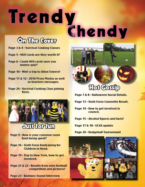

This is my finished preliminary task of a school magazine.
Thursday, 14 October 2010
Finished Front Cover of School Magazine

This is the my finished first attempt of the school magazine for Chenderit. I had never used Indesign before and only knew the basics on photoshop. I decided to target my magazine to Sixth Formers as I thought it would be interesting to do a more young adult style magazine for 16-18 year olds rather than a wider age group as I was able to target key ideas more easily. An example of this is the Survival cooking classes for university, as students leave home without basic cooking knowledge so that was the key idea for my magazine to promote. I had Elli in the middle of the magazine, with an apron, flour on her face and her smiling this was important as the classes need to be shown as fun and interesting rather than academic because the sixth formers wouldn't be interested otherwise. I named the magazine Trendy Chendy this is a casual name and would attract the students rather than the parents which I wanted. I managed to make the title glow with pink to make it stand out. i also decided to use pink as it appears in the main picture on the bowl and apron. I learnt to change colour's of text and give them a gradient. Another technique I liked was the outline of text with helped to emphasis the important of key phrases. The magazine differed from my flat plan because I only included two pictures, I thought that with too many pictures it would make the magazine too complex and would put students off reading it. I used a leaf style background to show that the magazine was the autumn addition. I cut Elli out on photoshop and inserted her onto the background, this was a good technique to learn as I may use it for my final music magazine. I am happy with my first attempt but I did struggle with trying to curve text around the prom photo, which would have been good to know. I now know that I should situate the picture more to the right as I couldn't fill a gap as it didn't look right.
Tuesday, 5 October 2010
Flat plan for school magazine

This is the flat plan for my school magazine, aimed at sixth formers, i've designed it with the key aspect being the cooking classes for sixth formers to survive in university, and 3 images down the right hand side of other aspects of sixth form life such as a mini football competition, and common room. On the left I will have writing advertising the new classes, and what to expect in the magazine but also include a competition to attract the sixth formers.
Ideas for the school magazine
This was a quick brainstorm of names for my magazine, the possible target audiences, props that I may use, and what were the key main ideas that the magazine is trying to promote.

Subscribe to:
Comments (Atom)