I choose a pink gradient
Rate this magazine in terms of how professional it looks?
Tuesday, 15 February 2011
Editing images for my contents page
Wednesday, 9 February 2011
Friday, 4 February 2011
Progress of front cover
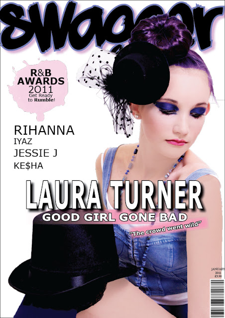
Here I have added some names down the side of artists that will feature in the magazine. I have also chosen to add a drop shadow to the 'Laura Turner' as it makes it stand out more clearer. I have also added the date above the bar code.
Wednesday, 2 February 2011
Editing magazine
I found a clever text for the "Laura Turner" to be written in which my peers liked. I also made a paint splat by downloading a brush from: www.easyelements.com/free-photoshop-brushes.html I also moved the white background to just over the good girl gone bad as it made it less distracting. I also chose to make it pick to correlate with the paint splat.
Adding text to the magazine
I added the exclusive writing onto the magazine, however after asking my peers I found that the text was too thick and distracted them away from the swagger. I also tried to add a feathered background as I didn't want it to get lost in the picture.
Mast head
I have added the mast head to my magazine. I have chosen to have it behind the picture because this is a common convention on R&B magazines an example of this is VIBE magazine
Subscribe to:
Comments (Atom)


 This was the original image.


